A: In version 11, go to Help and search on "customize" or in the Contents, go to:
Toolbars, Menus, and Shortcut Keys > Customize Toolbars and Menus.
There are six topics on customizing items.
Regarding earlier versions:
Toad is well over a decade old now – so it’s neither unexpected nor unreasonable that its extensive feature list (i.e. all that is has to offer) has grown quite a bit over the years. And as with all software, such feature growth presents the Toad development team with a key and interesting challenge – how to best present all those features (i.e. the GUI design).
Now as with any software, there are two key constituencies to consider – new users and long time users. Both can actually suffer from the very same fundamental issue – feature overload. To new users it’s simply overwhelming all the "stuff” they see offered. And to old users, it just feels like “bloat” that’s been infused over the years. But it’s really just one problem – how does software with tons to offer design its GUI to suite both camps?
Now in the ideal world, the software would come with a magic beanie cap that you wear and plugs into your computer via a USB cable – and the software would simply read your mind to conform itself to your personal tastes. But we’re at least two more major versions of Toad away from that kind of solution. 
So most software, including Toad, simply offers a basic GUI design with the ability for users to easily customize all that they see – to make the tool work the way they do. But this requires some interaction between users and software to arrive at a happy solution.
Toad offers extensive customization capabilities to address this. Let me restate – because this is critical – you can configure Toad to make it look and work usually exactly the way you want. You "the end-user” merely must invest a couple minutes time to “Make it so” (as Star Trek’s Captain Piccard would say).
There are two generally viable GUI design alternatives for customizable software:
- Expose most, user turns off what they don’t want
- Expose little, user finds and adds in what they want
Toad is generally more like the first method than the second. That is, much of what Toad has to offer is turned on, so you can "see and turn off” what you don’t want. So why did we choose that method? It’s been our experience that people don’t read the release notes, don’t read the online help, don’t read the blogs, etc, etc – because they are busy people with demanding jobs. So the only reliable way for us to show what’s new each release is to display it prominently – and simply have you turn off whatever you don’t wish to use.
Obviously the second method sounds attractive in terms of keeping the product more streamlined – but then there’s that pesky issue about people being too busy to read the "
What’s New” documentation – so we end up with people saying I just wish that Toad could do task X and I’d be happy, when in fact it’s in there – and has been for years.
So rather than debate further about which method would be better, let’s just focus on accepting that Toad shows you what it has to offer and makes it easy to turn off what you don’t want – while also offering extensive customization capabilities, too. So I’m going to briefly mention a few key areas you can customize to your tastes – if you simply invest a few minutes to make the Toad experience suite your own special desires and needs. It’s no harder than what other popular software such as Microsoft Office offers.
Product Start-Up
The first screen you see when Toad launches is often a hot button for debate. The SQL and PL/SQL developers tend to favor starting up in the Editor, while DBA’s and some senior developers might prefer the Schema Browser. And for more business analyst type end-users the preferred first screen might be the Query Builder. A long time ago Toad simply had a drop-down list box in the options screen "Start-Up" section that listed the five or six screens people most often wanted. But over time that list kept growing, and so using a drop-down with a zillion entries became unwieldy. But the capability is still in there, and much easier to use once you look in the right place – Options->Windows.
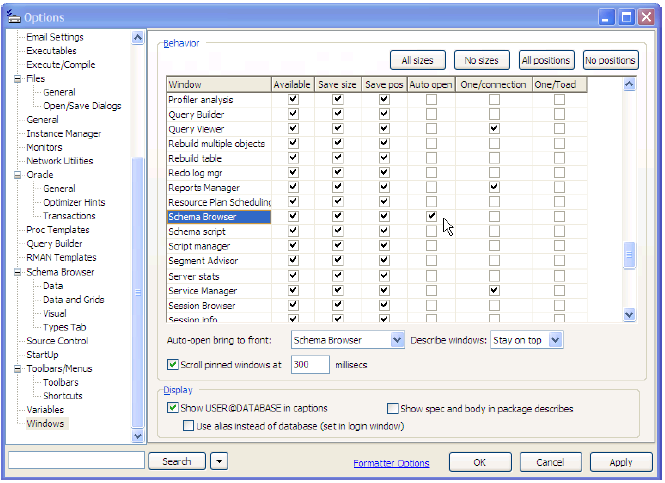
So this screen snapshot shows that I have my "Auto-Open" window set to be the Schema Browser. That’s indicated by the check box next to the arrow cursor near the center of the screen snapshot. So what does the "Auto-Open bring to front" drop-down list box do (that’s located below and to the left)? I could have checked several screens to auto open, and then this drop-down list would let me pick which of those several auto open screens to show at the forefront. So while one might argue that they miss the simple old way, the new way is much more user customizable and offers far more flexibility in what you can make Toad do at startup.
Menu & Toolbars
Many people express that they miss the old menus, hate the new menus, and/or wonder how we group items under menus – are we just plain nuts has been asked more than once. The answer is actually rather simple – since you can so easily customize the menus and toolbars to whatever you like, it’s pretty silly for us to spend inordinate amounts of time to "guesstimate” the ideal default menu and toolbar setups that will naturally suite the majority of users (remember, Toad now has well over a million users – so that’s probably simply not possible anyway). But it’s in there and easy to find and do. You simply need to right-hand-mouse click on either the menu or toolbar and choose custom – as shown here.
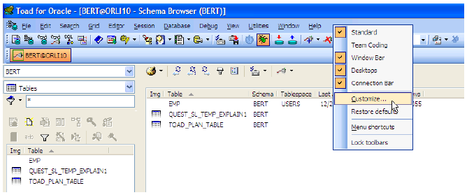
This will display the following screen:
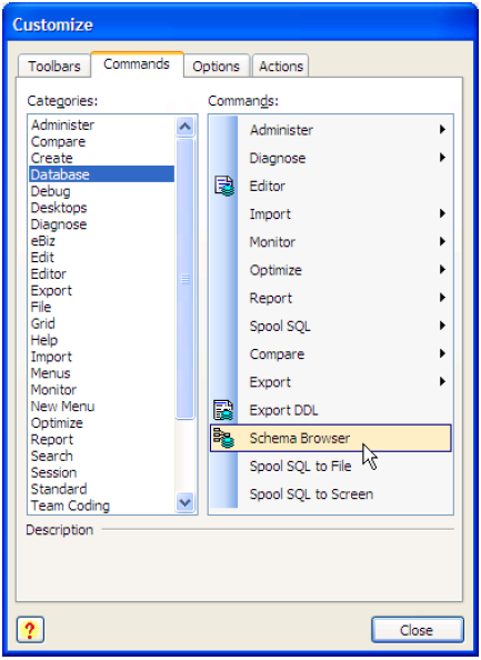
Now you can simply drag-and-drop things around both the menus and toolbars to your hearts content. You can create your own custom menu and toolbar designs to completely replace ours for those who just hate it.
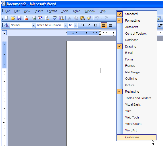
And for those who say this is just too hard to find or not the way other software does this, look at the screen snapshot of Microsoft Office below. Toad customizes just as easily as what other popular software packages do. You just need to spend five to ten minutes one time to make Toad look the way you want. That’s all there is to it.
Schema Browser
The Schema Browser is a highly customizable screen, yet many people often fail to utilize all the great capabilities this screen has to offer. That’s not really due to poor customization GUI design, but rather that this screen has so very much to offer – that there are several places (i.e. different locations) where customization comes into play.
First, the Schema Browser can be made to look any way you prefer – and the main customizations for this are shown in the Schema Browser screen snapshot shown here:
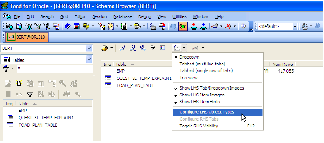
The first four radio-group menu items control the basic Schema Browser display style: drop-down (as my screen is setup), a multi-line tabbed view (the original & default), a single line scrollable tabbed view, or a tree-view – just like Quest’s SQL Navigator or Oracle’s SQL Developer. It’s totally up to you how the Schema Browser looks.
The second three checked menu items control how images and hints are handled for your selected display style: show tabbed/drop-down images, show LHS item images, and show LHS item hints (note – LHS stands for Left Hand Side of the "Schema Browser" screen). The first sets whether tabs and/or the drop-down list show the icons for the object type. So that would be the little table icon under BERT and right before TABLES. The second sets whether or not to show the icons before each table name that indicates its type (e.g. plain heap, partitioned, IOT, etc). The number one complaint we hear is that users choosing the tabbed display style don’t want the wasted real-space consumed to show the object type icons – what genius came up with this. The answer – just turn it off then. My point – it’s customizable and it’s easy. Simply turn off what you see you don’t like.
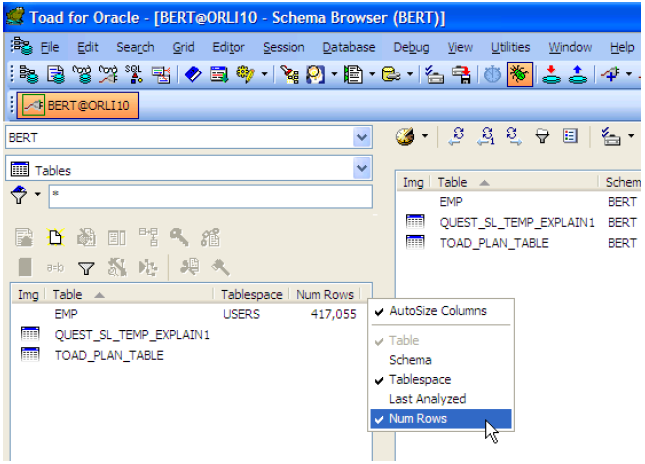
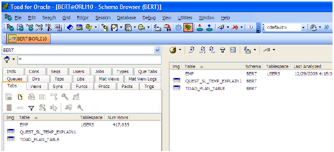
So let’s look deeper at the LHS display – we often hear something like "boy I just wish Toad would show more stuff that’s important to me." For example – I wish I knew what tablespace the table is in and its row count. Guess what – it’s in there. Look at the next screen snapshot – you simply pick from some pre-selected column we thought would be useful and not add too much overhead on the database server to add.
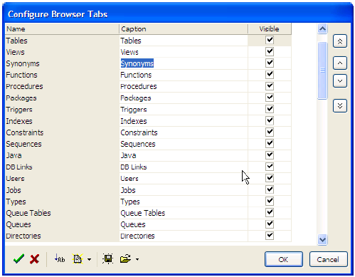
Another question we get a lot: "For those of us using the tabbed display style – why can’t Toad just be smarter about the real estate space it uses?" Guess what – it’s in there and it can, you simply need to tell Toad what you desire. Look back to the first screen snapshot in this section (i.e. two screen snapshots back). See the highlighted choice – Configure LHS Object Types? It launches a LHS customization screen shown below where you can define the tab order, tab captions and which tabs are visible.
Thus you can very easily change this default (overloaded and cluttered) tabbed display:
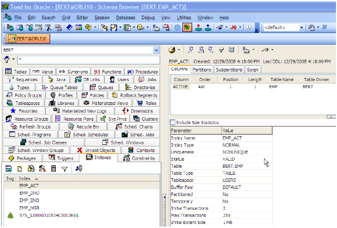
Into this cleaner and friendly Schema Browser – you just have to invest to make it so 
Editor
Because for many people the Editor is the #1 feature they use, we’ll cover this in an upcoming separate tech brief. So look for this one to come soon.
Data Grids – (Schema Browser & Editor)
This area too deserves a fair amount of attention. So for now we’ll promise to cover this one too in a future tech brief.
Q: How to Setup & Use Toad in a Secure Environment
Start the discussion at forums.toadworld.com